Client
Play Magnus
year
2017
Role
Art direction / Visual design / Concept design
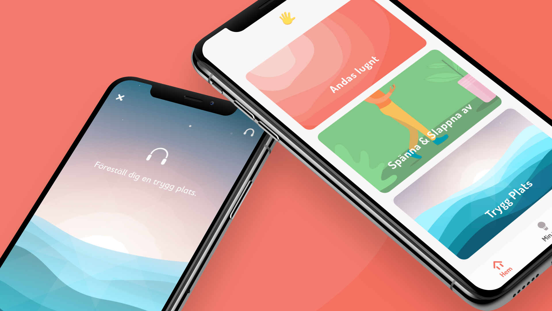
how to teach chess to people new to the game, in a fun and approachable way that isnt intimidating.
how to teach chess to people new to the game, in a fun and approachable way that isnt intimidating.
how to teach chess to people new to the game, in a fun and approachable way that isnt intimidating.
how to teach chess to people new to the game, in a fun and approachable way that isnt intimidating.
how to teach chess to people new to the game, in a fun and approachable way that isnt intimidating.
Together with the Play Magnus team, Me and Geoffrey (a brilliant UX designer and friend) we set out to create chess platform for people interested in learning the game of chess that did not have any(or little) knowledge of the game.
I set the Art direction for the product, with the goal of making it approachable, exciting, and true to Magnus brand. As a team, we created the concept through a series of definition workshops that led to the end result we have now. It was important for the client to stay true to chess and not gamify the experience to much by distancing the user from core skills needed to play for the sake of retention. We solved this by breaking apart all basic movements and skills in chess, and isolating them. Presenting and explaining each in a fun and pedagocical way.
How did it end up? A loved product that resonates with people! An App Store rating of 4,7 & and revenue creating platform for Play Magnus. A true success story⚡️.
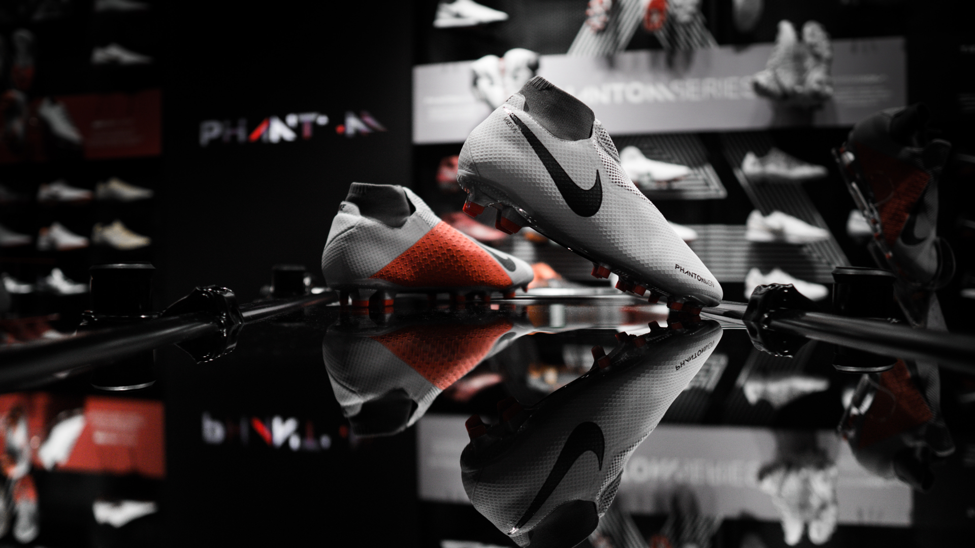
A minimal, simple product that is solving the key issues a Visual Merchandiser have to deal with in their daily work. By creating a sleek platform where all people involved: management, the visual merchandisers and the teams updating collections, could add their content and slipstream their workflows greatly.
I wanted to create a minimal and utilitarian experience that have a clear focus on solving the needs, but still making it feel Nike by keeping the Trademark Nike headline font and using strong, clean colors and graphics.
My tasks ranged from setting up a design language that worked well both in native ios, android and web environments, and making sure that the design was aligned to the Nike brand.
This was definitely a team effort! The team consisted of Michael Rosenberg (PO), Jesper Svenning (UX design), Erik Alfredsson (iOS developer), Mikael Johansson (Android developer) and Alexander Björk (web developer).
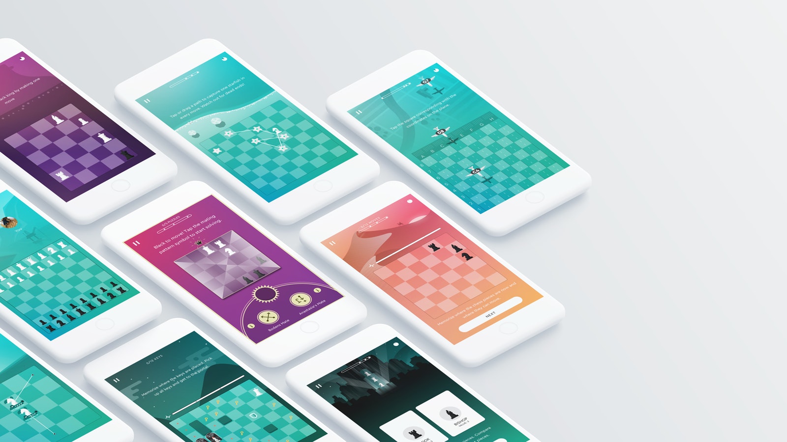
Overview of game screens, showing a variety of ways to learn chess.
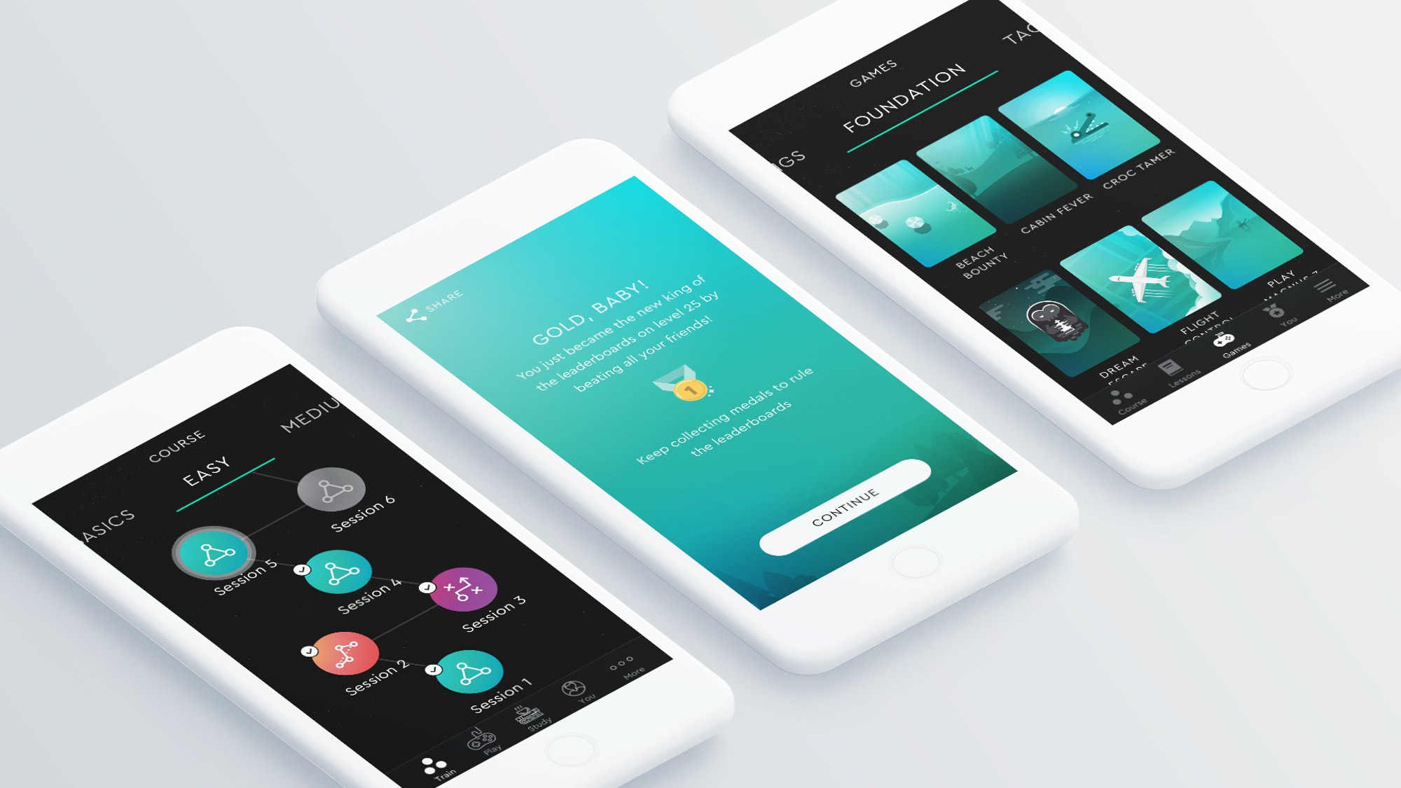
From left to right: 1. Course timeline and number of sessions left in the category. 2. Badge screen that comes after a goal have been reached. 3. Game overview within a specific category
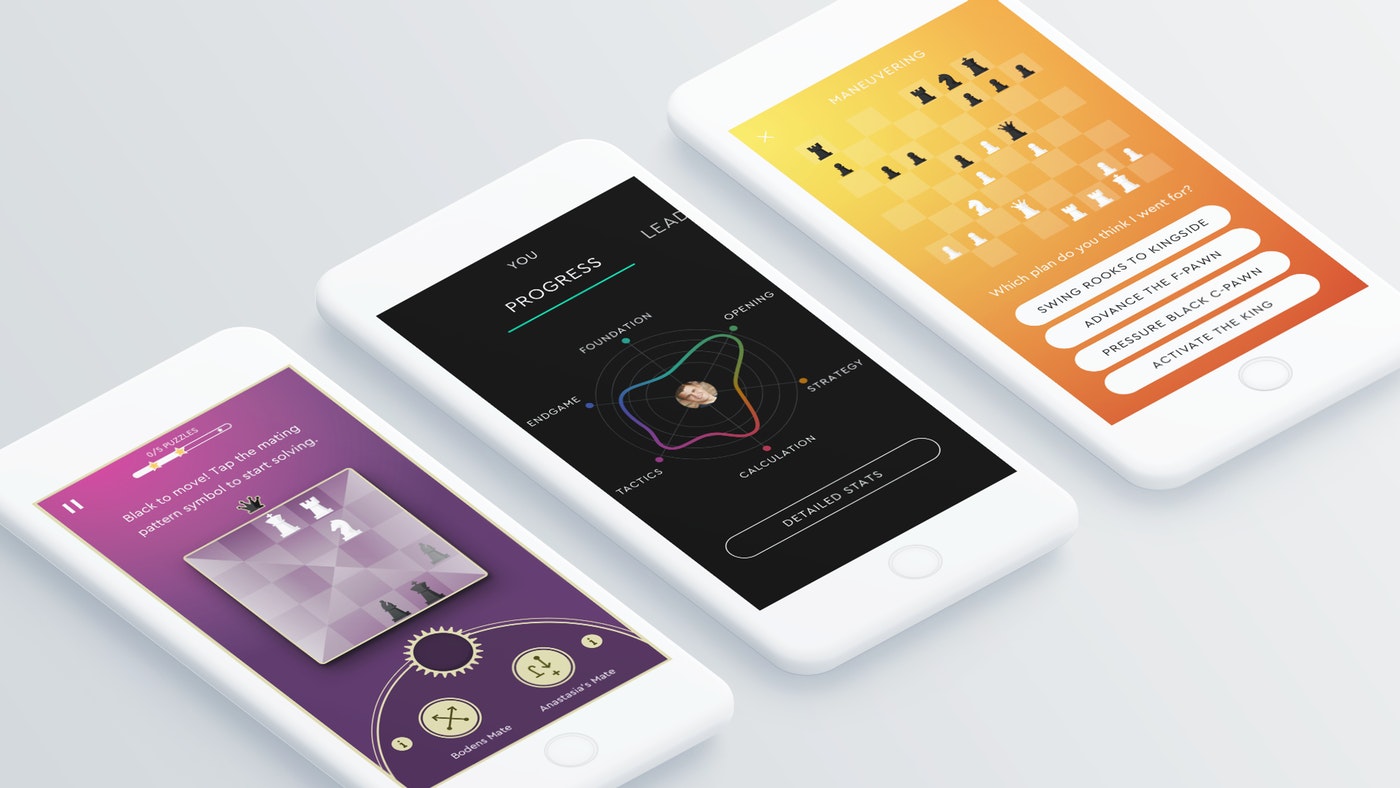
From left to right: 1.Game design. 2.Progression view. 3.Theory screen.
The game can be downloaded on any good appstore. Test it out for yourself?
Selected Works
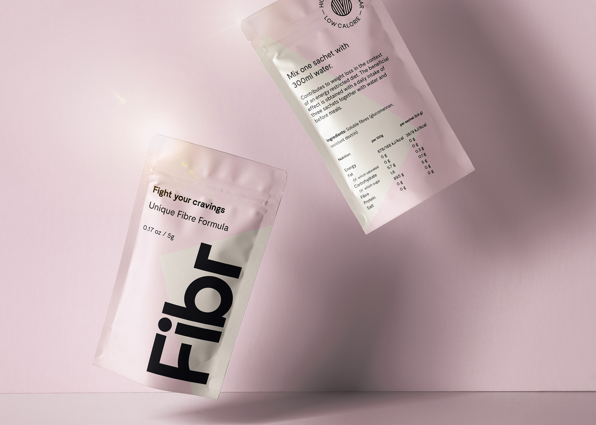
Fibr - Fight your craviingsIdentity, Packaging, visual design
Rädda Barnen - Safe PlacesCreative direction, Visual design, development
NikeVisual design
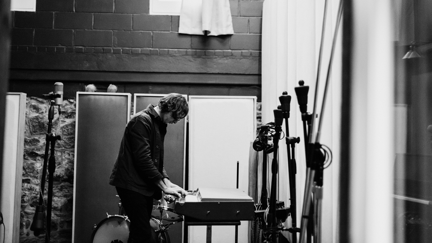
SennheiserArt direction

BMW AlphabetVisual design, Concept design

Play Magnus - Magnus trainerArt direction, Visual design, Concept design
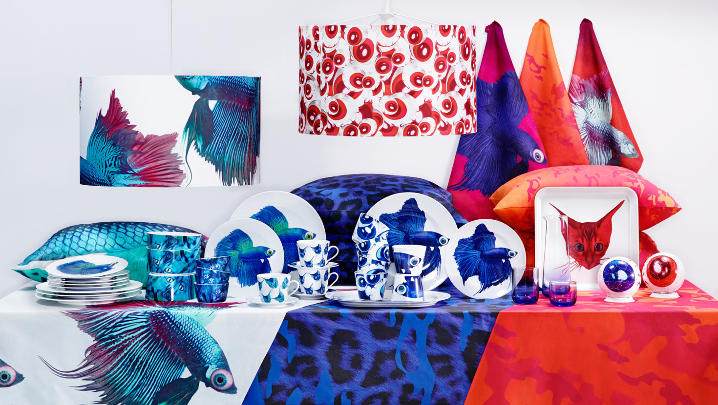
IKEA - Giltig collectionArt direction, Visual design, Concept design
© 2020 Billy Morén. All Rights Reserved
© 2020 Billy Morén. All Rights Reserved
© 2020 Billy Morén. All Rights Reserved
© 2020 Billy Morén. All Rights Reserved